Digital Product Branding
It is through design that a brand strives to communicate clearly with the target audience.
Project Cast Study: Digital Bank Project
![]()
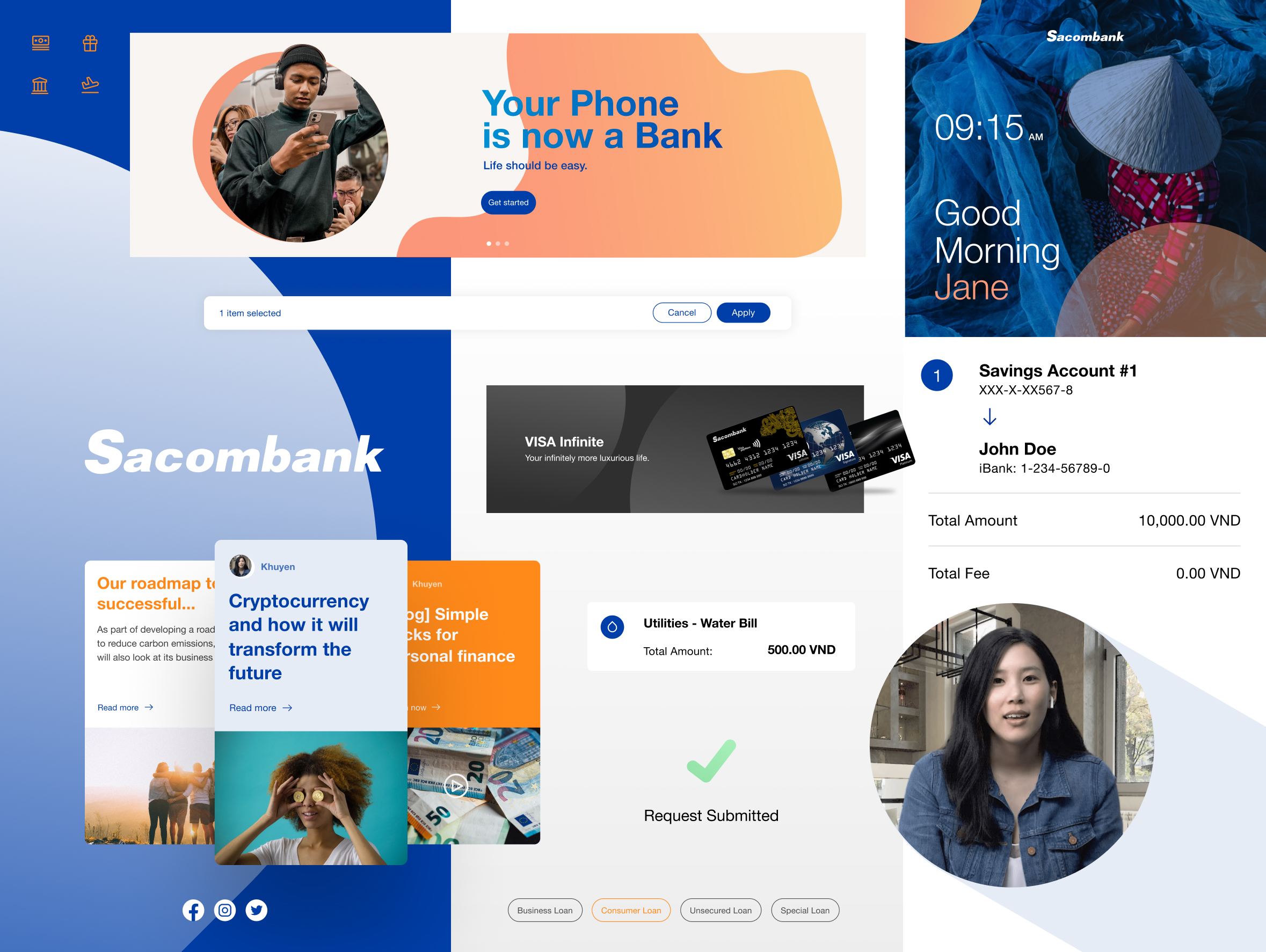
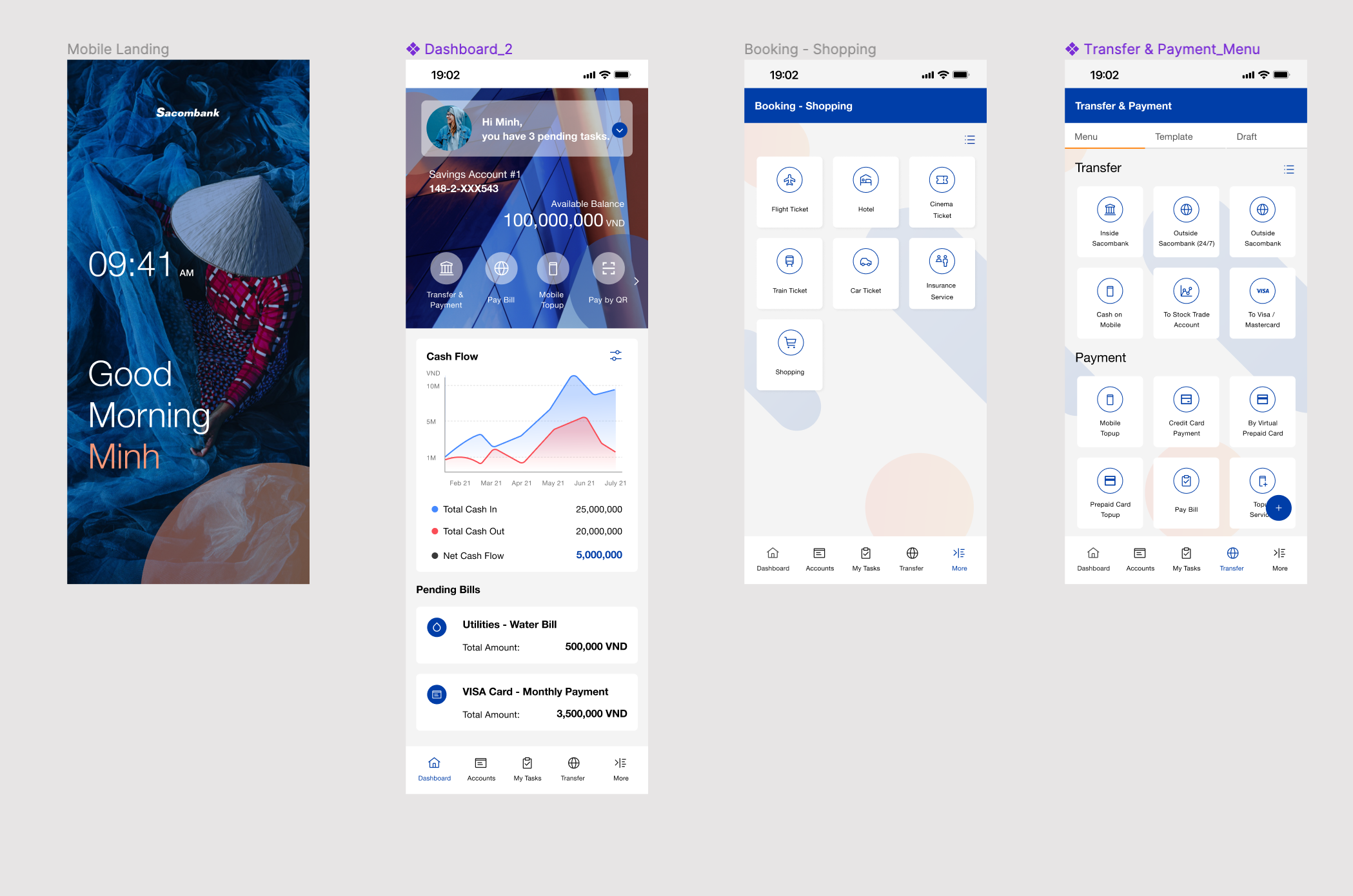
Sacombank is is a joint stock commercial bank in Vietnam , established in 1991. They were looking to rebranding the image of the bank to be more engaging for young customers. Working with Singapore team, the website and mobile application are the main areas I focused on in the engagement process before we’ve won the projects.
![]()
![]()
Project Cast Study: National Corporate Identification Project
![]()
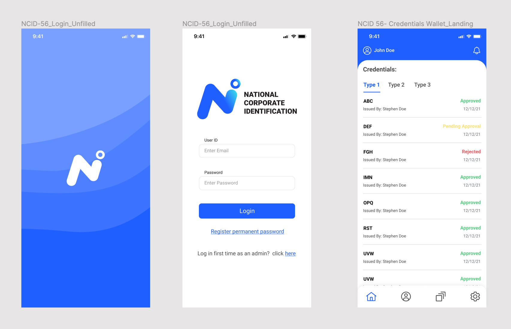
I worked as Lead UX and UI for a team of 5 designers. In this project, we were building an identification process that will be used by BOT (The Bank of Thailand), The Banks, and the Corporation's line of authority.
The idea is when corporate submit documents that will be used to e.g open bank accounts. BOT and the banks can verify those documents.
We provide 2 different web applications for BOT and the bank staff and build one the wallet mobile application for the corporate to use.
These are the new solutions and the client didn’t have any brand guideline. Therefore, I came up with a few options below.
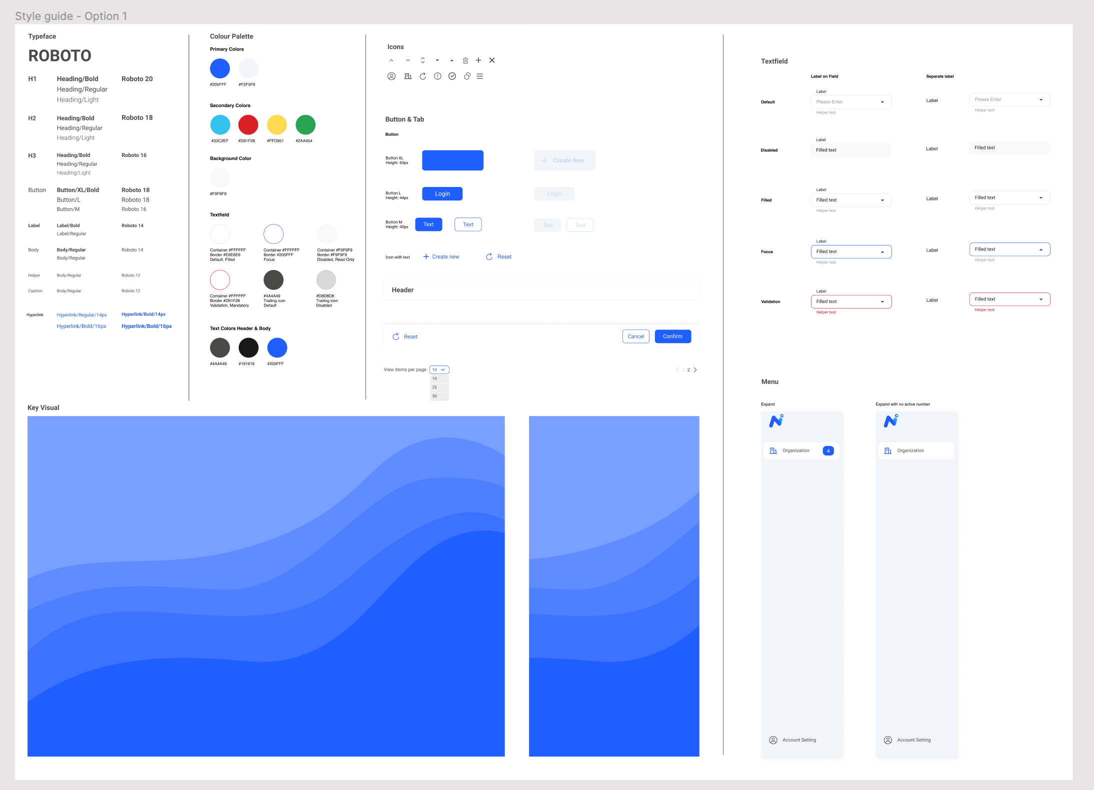
The first option: This key visual represents a revenue graph that shows dynamic movement. The different shades of blue are visually soft. The layout has the login screen in the center with a box shape text field and rectangular button.
Web Application: A
![]()
On the landing screen we use a side menu bar with a simple page name on top and a clickable hyperlink data table with pagination at the bottom. The CTA button is in the top right corner for clear visibility and creates a new organization row in the table.
The detail screen has breadcrumbs to guide the user through the screens. Under the breadcrumbs are two tabs that allow to toggle between an inactive and active screen. If the user screen is not filled in, then the confirm button is disabled. The roboto font is applied to the first and second option. At the bottom is a fixed footer with two CTA buttons along with a reset option.
For the mobile I applied the same key visuals, fonts, and other ui elements as we used for the web app.
Mobile Application: A
![]()
Here is the rough draft of style guide for the first option that includes the typeface, color scheme, icons, text fields, etc.
Styleguide: A
![]()
The 2nd option: The login screen’s key visual is a tree shape the tree represents growth and the same dynamic movement with the logo’s visually soft blue color and curve. The blue color scheme is timeless and flat with a simple line text field. We use different style from the first option.
Web Application:B
![]()
For this landing screen, everything remains the same except for the side menu color, white background color and CTA button color, this style producing a smooth, softer effect than in the first option which has a gray background and more segmented block style.
Everything remains the same for the 2nd option detail screen except for the footer and text fields.
Styleguide: B
![]()
Mobile Application: B
![]()
The third option: The circle shape key visual here represents unity and the same dynamic movement from the circle in the lower case letter ‘I’ like the logo. The gradient color lends movement to the design. The layout on the left side has the option for a tagline or motto. The login button is round and the hyperlink is clean and without a line, utilizing Rubik font, which is bolder and more authoritative.
Web Application: C
![]()
The landing screen applies the gradient in the side menu and a changed position of the logo. The side menu also connects directly with the rest of the screen and employe a bold font for the title instead a header bar. The CTA and filter buttons both are round. The pagination scheme has a similar hyperlink like in the login screen, which is different than the first and second option’s pagination scheme.
The detail screen employs the same font and button shape as the landing screen. It has a floating footer which is different than the first and second options.
Styleguide: C
![]()
Mobile Application: C
![]()
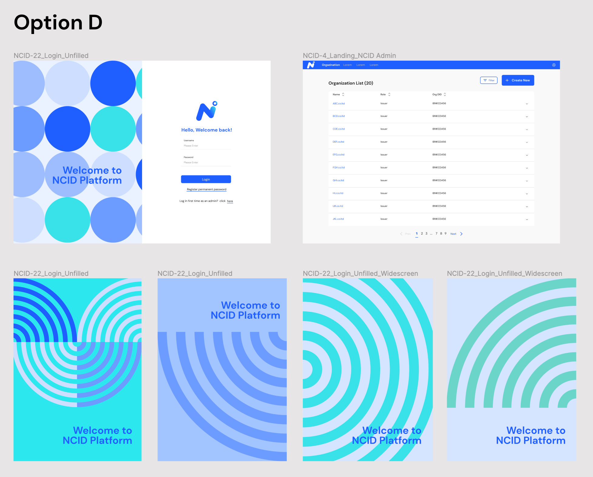
The 4th option: Here we have a variety of key visuals which are more flexible and contemporary friendlier in how they approach the design. The circle keeps up the theme of togetherness and cooperation with different players coming together to build a significant platform. The new fingerprint graphic echoes the theme of identification but still has a circular form that represent the theme of togetherness and cooperation, all key visuals utilize the different shade color from the logo.
Web Application: D
![]()
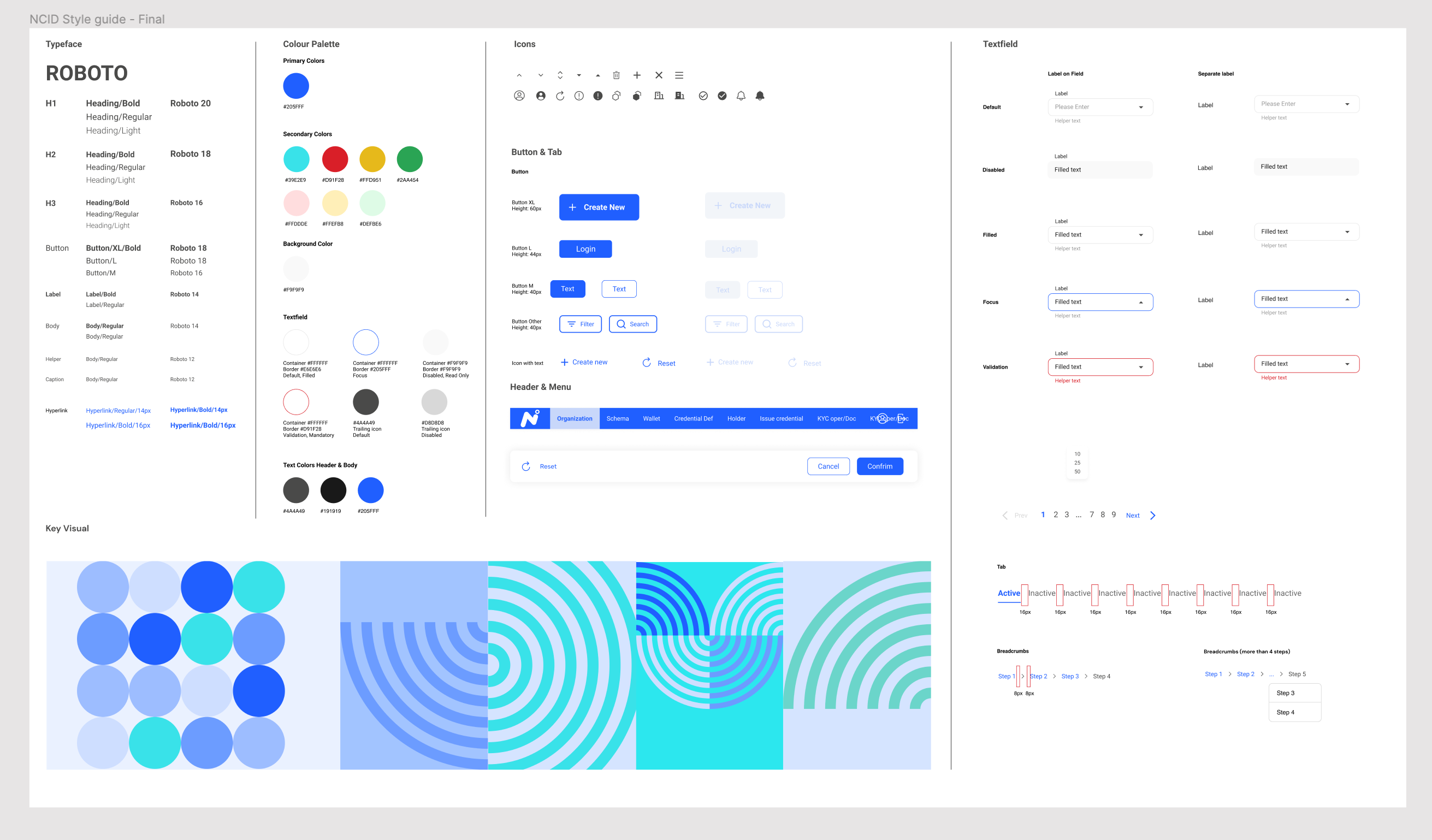
The typeface is friendlier and the hyperlink are different.
The landing screen has a menu bar on the top instead of on the side, which allows the user to focus on the main task and gives a clearer, cleaner space for the user.
DM Sans font is applied to this option. It’s more contemporary and not as bold as Rubik.
The detail screen employs the same font and button shape as the landing screen. It has a floating footer.
Styleguide: D
![]()
Mobile Application: D
![]()
For the mobile we applied the same key visuals, fonts, and other ui elements as we used for the web app.
Most of the design using blue from the logo and also because blue is a formal color that is used for signatures on business documents and official forms.
From 4 options we recommend the Contemporary option (Option D) and the client loves it! Because it’s more flexible friendlier and it keeps the theme of togetherness and cooperation. In term of the layout we think it’s better for the user to focus on the main task and gives a clearer, cleaner space for the user with easy to access top menu bar. Which one do you like the most? :)
in a way that cannot be removed or forgotten.
It is through design that a brand strives to communicate clearly with the target audience.
Project Cast Study: Digital Bank Project
Sacombank is is a joint stock commercial bank in Vietnam , established in 1991. They were looking to rebranding the image of the bank to be more engaging for young customers. Working with Singapore team, the website and mobile application are the main areas I focused on in the engagement process before we’ve won the projects.

Project Cast Study: National Corporate Identification Project

I worked as Lead UX and UI for a team of 5 designers. In this project, we were building an identification process that will be used by BOT (The Bank of Thailand), The Banks, and the Corporation's line of authority.
The idea is when corporate submit documents that will be used to e.g open bank accounts. BOT and the banks can verify those documents.
We provide 2 different web applications for BOT and the bank staff and build one the wallet mobile application for the corporate to use.
These are the new solutions and the client didn’t have any brand guideline. Therefore, I came up with a few options below.
The first option: This key visual represents a revenue graph that shows dynamic movement. The different shades of blue are visually soft. The layout has the login screen in the center with a box shape text field and rectangular button.
Web Application: A

On the landing screen we use a side menu bar with a simple page name on top and a clickable hyperlink data table with pagination at the bottom. The CTA button is in the top right corner for clear visibility and creates a new organization row in the table.
The detail screen has breadcrumbs to guide the user through the screens. Under the breadcrumbs are two tabs that allow to toggle between an inactive and active screen. If the user screen is not filled in, then the confirm button is disabled. The roboto font is applied to the first and second option. At the bottom is a fixed footer with two CTA buttons along with a reset option.
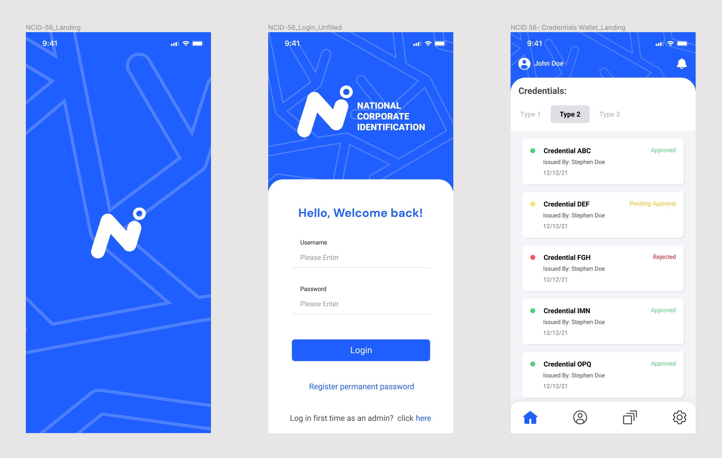
For the mobile I applied the same key visuals, fonts, and other ui elements as we used for the web app.
Mobile Application: A
Here is the rough draft of style guide for the first option that includes the typeface, color scheme, icons, text fields, etc.
Styleguide: A
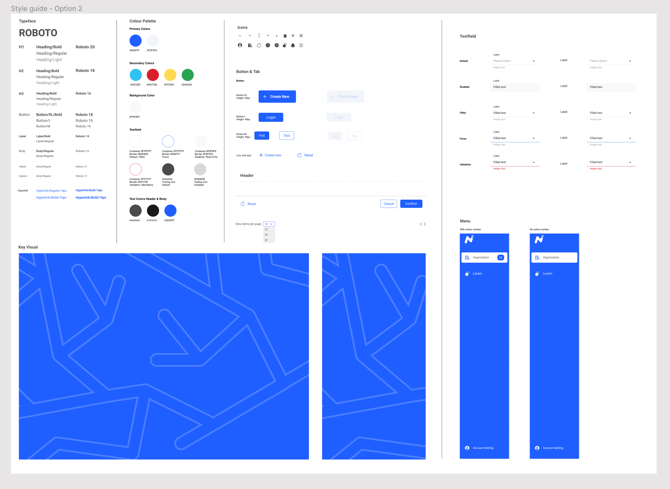
The 2nd option: The login screen’s key visual is a tree shape the tree represents growth and the same dynamic movement with the logo’s visually soft blue color and curve. The blue color scheme is timeless and flat with a simple line text field. We use different style from the first option.
Web Application:B

For this landing screen, everything remains the same except for the side menu color, white background color and CTA button color, this style producing a smooth, softer effect than in the first option which has a gray background and more segmented block style.
Everything remains the same for the 2nd option detail screen except for the footer and text fields.
Styleguide: B
Mobile Application: B
The third option: The circle shape key visual here represents unity and the same dynamic movement from the circle in the lower case letter ‘I’ like the logo. The gradient color lends movement to the design. The layout on the left side has the option for a tagline or motto. The login button is round and the hyperlink is clean and without a line, utilizing Rubik font, which is bolder and more authoritative.
Web Application: C
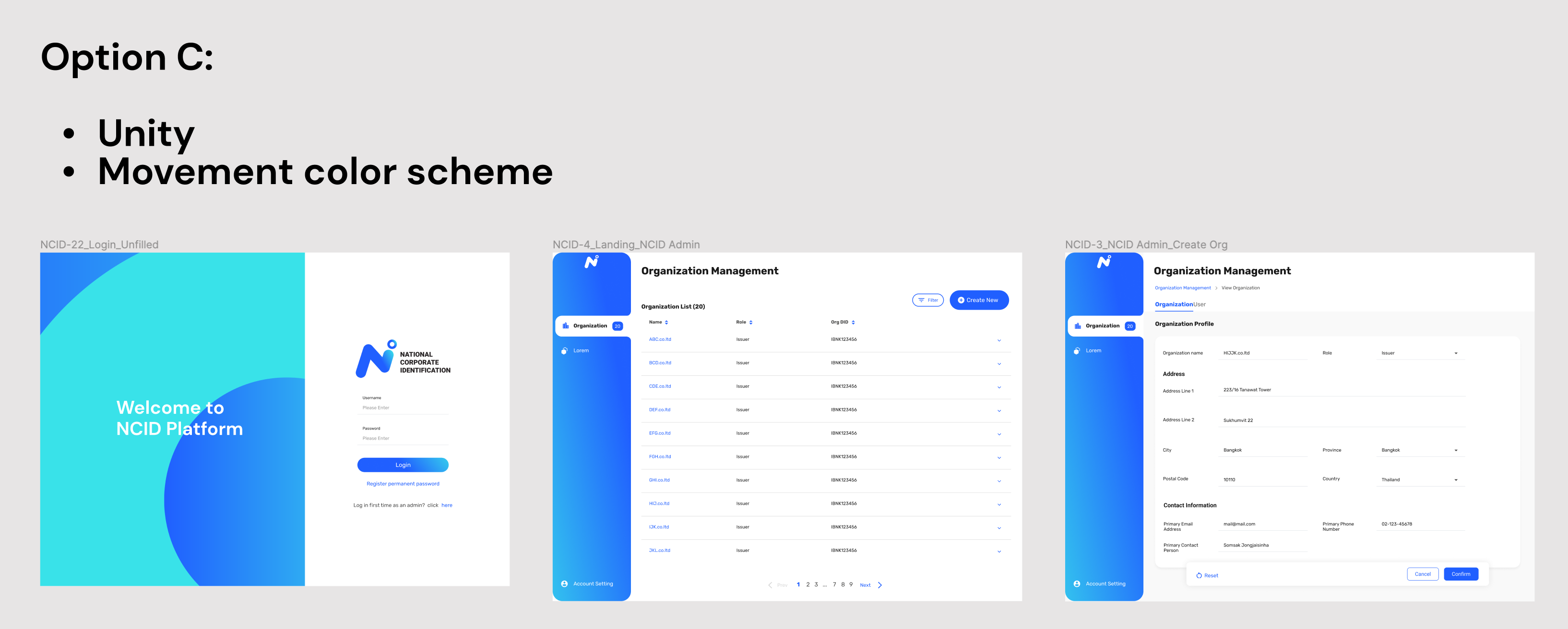
The landing screen applies the gradient in the side menu and a changed position of the logo. The side menu also connects directly with the rest of the screen and employe a bold font for the title instead a header bar. The CTA and filter buttons both are round. The pagination scheme has a similar hyperlink like in the login screen, which is different than the first and second option’s pagination scheme.
The detail screen employs the same font and button shape as the landing screen. It has a floating footer which is different than the first and second options.
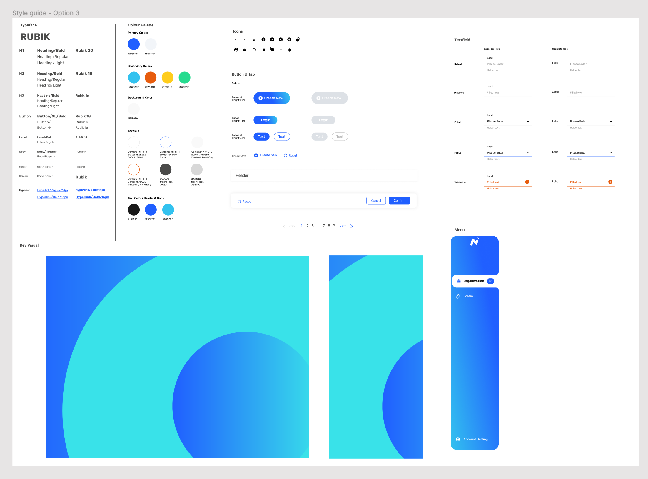
Styleguide: C
Mobile Application: C
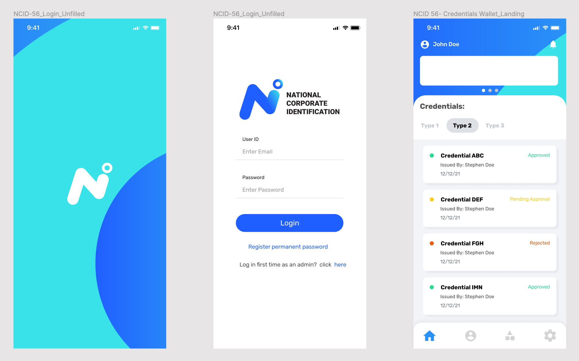
The 4th option: Here we have a variety of key visuals which are more flexible and contemporary friendlier in how they approach the design. The circle keeps up the theme of togetherness and cooperation with different players coming together to build a significant platform. The new fingerprint graphic echoes the theme of identification but still has a circular form that represent the theme of togetherness and cooperation, all key visuals utilize the different shade color from the logo.
Web Application: D
The typeface is friendlier and the hyperlink are different.
The landing screen has a menu bar on the top instead of on the side, which allows the user to focus on the main task and gives a clearer, cleaner space for the user.
DM Sans font is applied to this option. It’s more contemporary and not as bold as Rubik.
The detail screen employs the same font and button shape as the landing screen. It has a floating footer.
Styleguide: D
Mobile Application: D

For the mobile we applied the same key visuals, fonts, and other ui elements as we used for the web app.
Most of the design using blue from the logo and also because blue is a formal color that is used for signatures on business documents and official forms.
From 4 options we recommend the Contemporary option (Option D) and the client loves it! Because it’s more flexible friendlier and it keeps the theme of togetherness and cooperation. In term of the layout we think it’s better for the user to focus on the main task and gives a clearer, cleaner space for the user with easy to access top menu bar. Which one do you like the most? :)